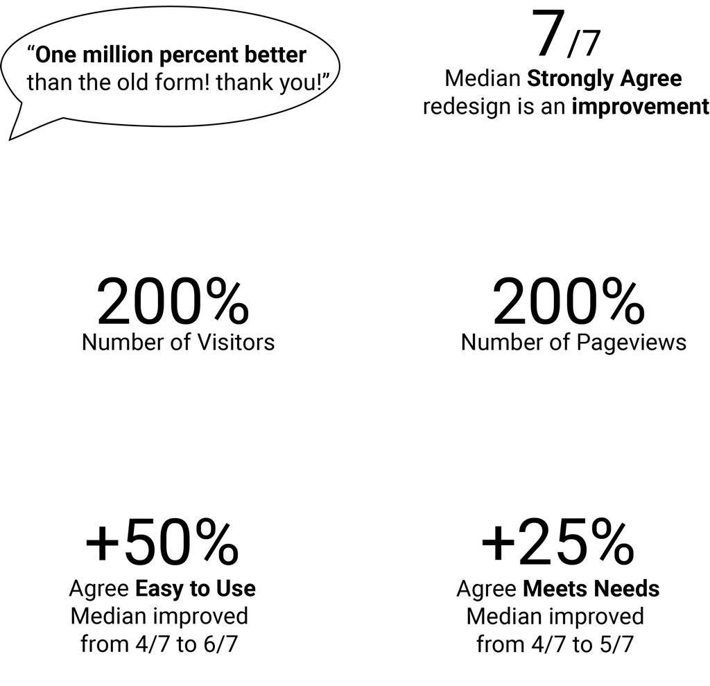
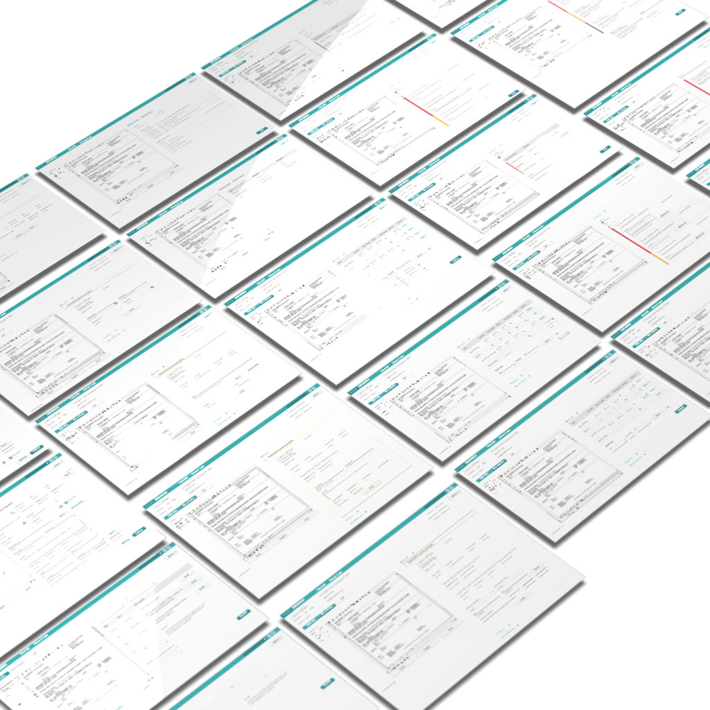
“Excel isn’t a form builder,” you might say. I agree. As we learned from users and internal consultants, Excel was being used as an inelegant workaround for missing functionality in the software’s legacy form builder. Despite 4 changes in Product Owner, a fluid development team, 2 project stops and starts due to shifting business priorities, and 2 “oops” releases (release pipeline and resource usage issues), we managed to double the number of users and amount of traffic (and increase utility and usability feedback scores) in the redesigned form builder by making it easier to use than Excel.
UX Lead
UX Design
UX Research
UX Strategy
Product Manager
Product Owner
Technical Manager
UX Researcher
Subject Matter Expert
Development Team
Prep Work
Before anything else, I checked out the legacy form builder. I jotted down heuristic evaluation notes, questions, and ideas while everything was fresh and unbiased by folks more familiar with the product. I do this first for a couple reasons. First impressions can be insightful and you only get one chance to have that perspective. I also find I can make better use of others’ time when I have an understanding of the fundamentals and an initial point-of-view. To help everyone be on the same page and to provide context for future collaborators, I created a page on the company’s intranet outlining the stakeholders, current state of the form builder, and the design stages.
Discovery
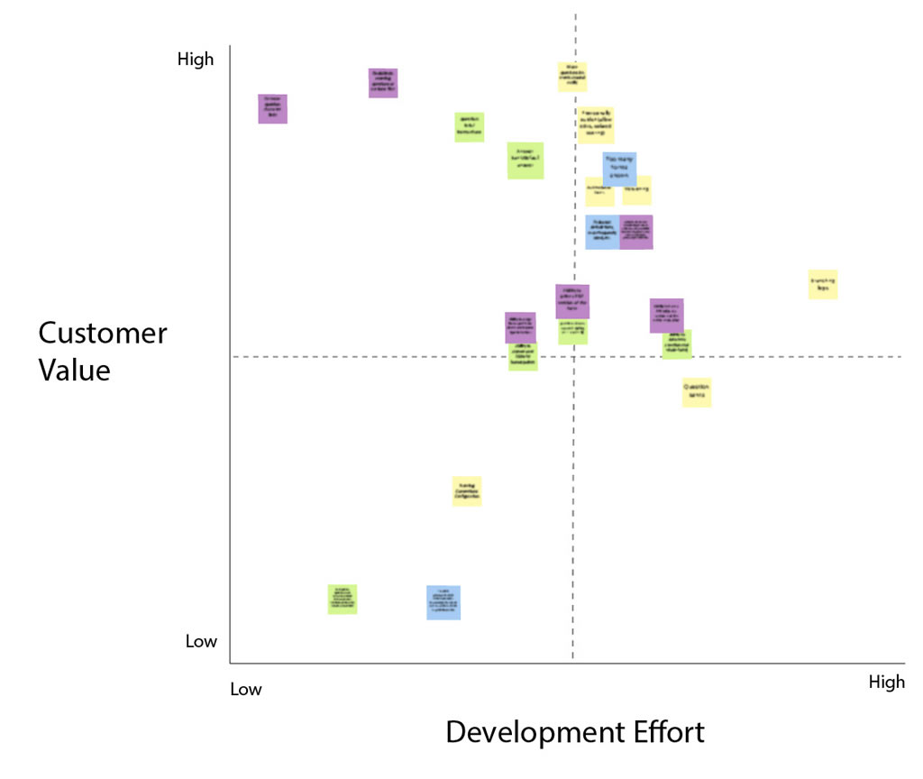
I worked with a subject matter expert (SME), the product owner (PO), and developers to come up with some possible topics and questions to discuss with customers. One thing that I was wondering about was the order in which form creators worked. The legacy product forced users to create sections first, and then fill them with questions. Did this match the mental model and practice of users? Or did they create questions first and then organize them into sections? A UX researcher was hired around this time, so I sought out her feedback and input for research plans. I led interviews with customers and customer consultants to learn about the shortcomings of the legacy form builder and opportunities for the redesign. (In case you were wondering, it turned out that some users created sections first and then filled them with questions, while others created questions and then grouped them into sections. It looked like a more flexible design was warranted!) Next, the UX researcher, SME, and I did some initial sorting, clustering, and prioritizing of problems. We then met back up with the PO and dev team to refine priorities, and to estimate relative development efforts. Finally, we discussed which problems we would tackle for the MVP with the Product Manager.
Design Iterations
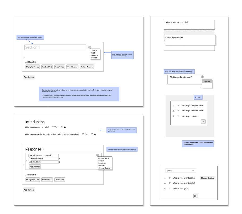
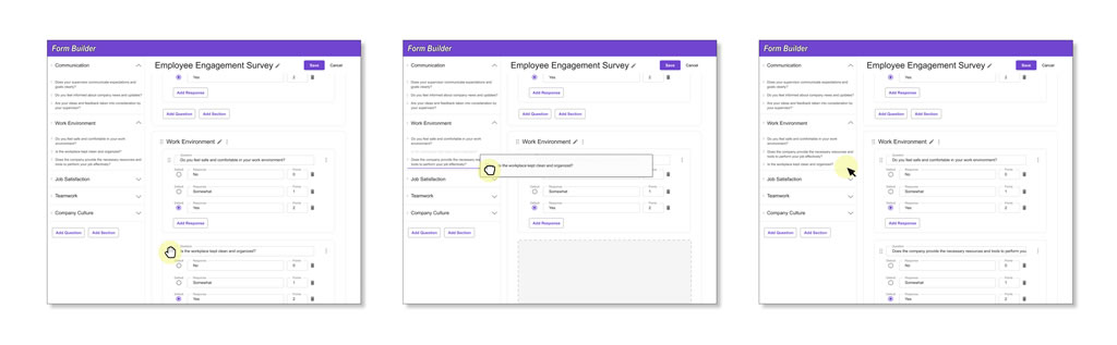
At this stage, we came up with success metrics like usage, feedback, and signals indicating the use of Excel (import and export). We started monitoring the legacy form builder to create baseline measurements. Moving into solutioning, I began by creating low-fidelity wireframes, conducting precedent research (how have others designed form builders?), and compiling a list of questions. I brought those to discuss with the PO and development team, as well as the newly formed Product Design team. With their input and feedback, I went through a few iterations of brainstorming, feedback and analysis, and refinement, increasing fidelity as ambiguity was replaced with clarity. Some designers wait until the end of their process to show their work to developers. Not me! I love including developers throughout the process, because they can come up with questions and alternative solutions that are often helpful, and unique to those thinking about how to implement designs.
Results
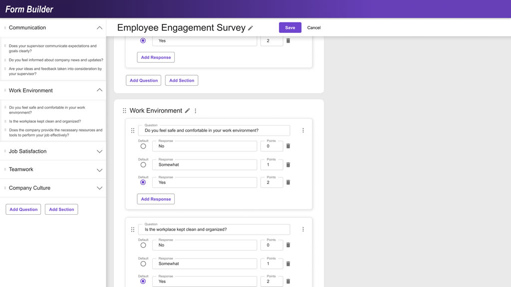
I made myself available for questions and clarifications as developers worked on implementation. After a couple code-related hiccups, we shipped it and held our breath as usage metrics and user feedback slowly rolled in. We were pleased by what we saw! User numbers and usage rates doubled, and we saw increases in utility and usability user feedback scores (despite low response rates). However, we were surprised to see that import/export (Excel?) usage remained steady, as well as the number of forms created. We expected those to fall and rise, respectively. The team will have to talk with users in order to get to the bottom of that, while they roll into phase two with additional functionality!
The project goal was to redesign a legacy internal-facing application to increase user efficiency. Most stakeholders were new to working with UX, so I also served an educational role and worked to integrate UX into existing product development processes.
UX Lead
UX Strategy
UX Design
UX Research
2 UX Designers
Chief Business Owner
Chief TPO
3 Business Owners
5 TPOs + Dev Teams
User Interviews
We viewed and listened to unmoderated synced screen and phone recordings to research current user flows in context. We also conducted moderated user interviews to acquire both quantitative and qualitative data. This data was then compiled to create personas, refine business requirements, and direct later design and research activities.
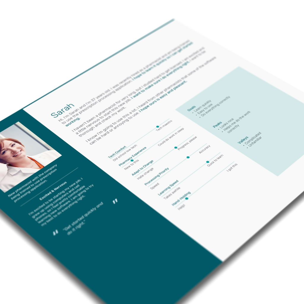
We created user personas to direct our design strategy and discussions. These personas were based on data collected from user interviews, surveys, and company demographic data.
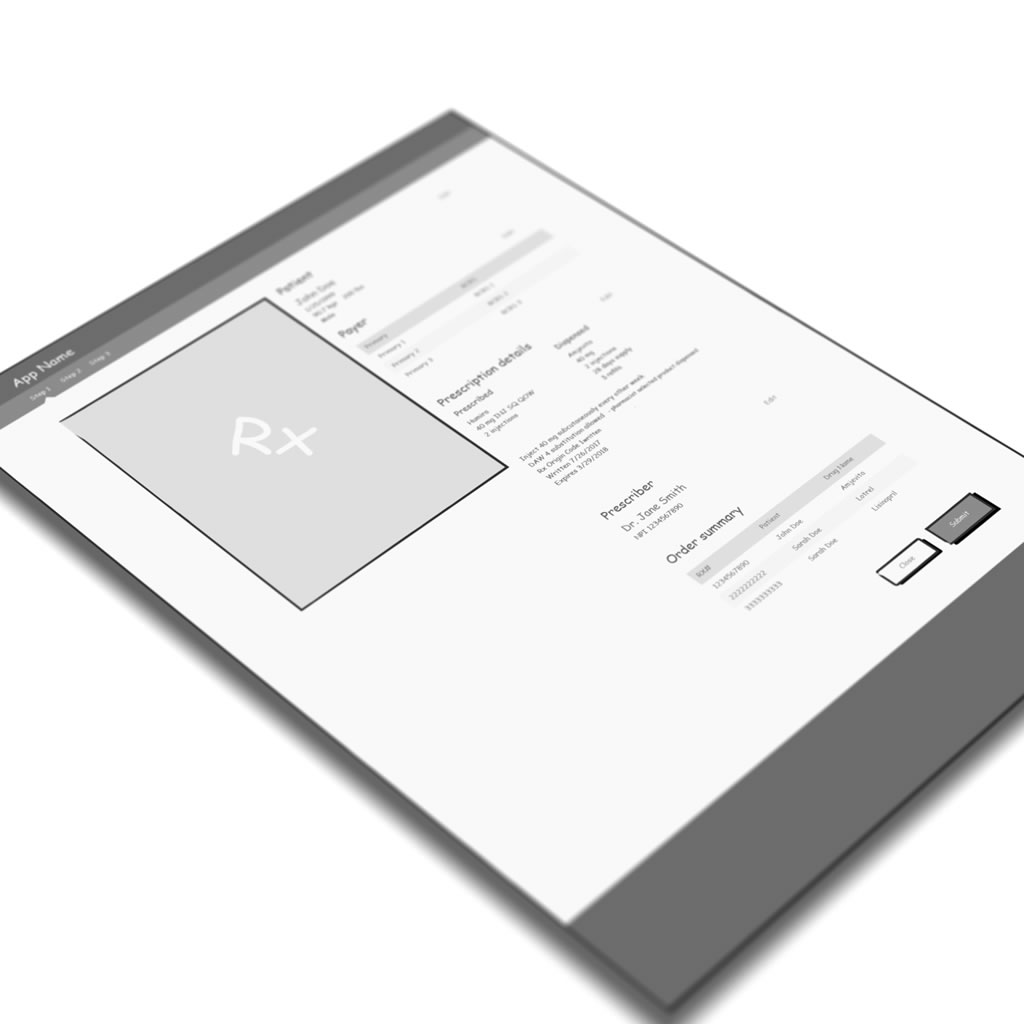
Wireframes
Progressing into a design phase, we created user flows and wireframes based on business requirements and user data. Working in low-fidelity enabled us to brainstorm and iterate more rapidly, and made it easier to focus on bigger picture design decisions. It also allowed us to get stakeholder feedback early in the process without a big investment of time and resources.
User Study
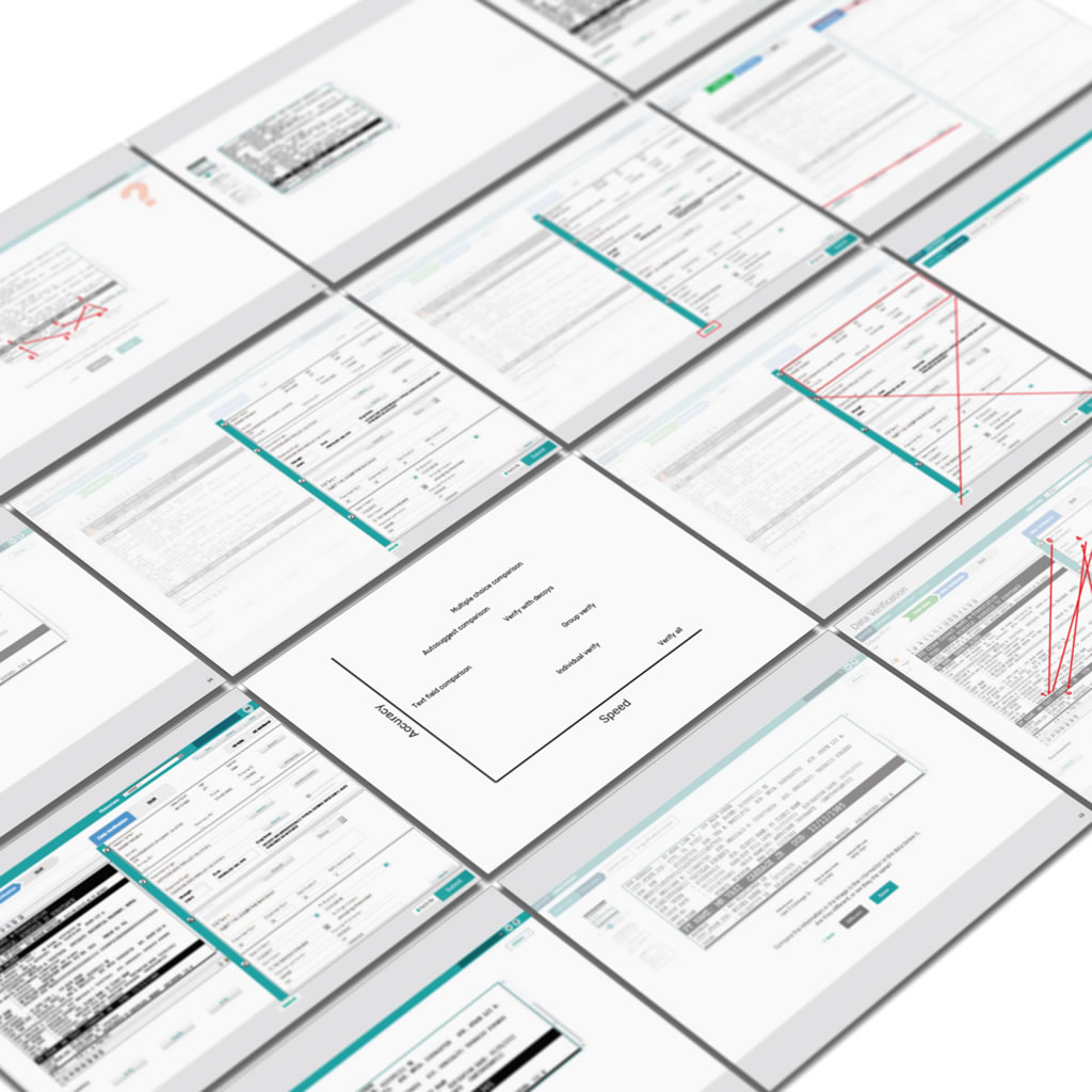
When refining business requirements, we suggested that in addition to user efficiency, accuracy was a potentially important metric for this project in terms of design and research. We did some research to confirm its importance, and began brainstorming several potential solutions.
We tested multiple design solutions and evaluated them according to user efficiency and accuracy. With this data, we worked with stakeholders to determine the most appropriate design.
Mockups
We created high-fidelity mockups as one part of the handoff from UX to the development teams. We also provided a guide for implementation. We made ourselves available during development and reviewed complete work.
We contributed and adhered to the company design system and style guide during the creation of high-fidelity mockups. Following implementation by the development teams, we conducted further usability testing and evaluated performance against the baseline legacy application.
Results
User efficiency increased 144.4% while accuracy also increased. These results are expected to improve the end user experience while providing a substantial financial benefit to the company. User feedback was also very positive. A user survey highlighted the redesign's simplicity, workflow, ease of use, efficiency, presentation, and intuitiveness, among other benefits.
Have you ever stared blankly at your screen, fingers hovering over your keyboard, while desperately trying to convey a thought or an idea in just the right way? This project is an AI-based web app designed to rephrase text according to the user’s desired alterations. Its aim is to save users time at school, work, and home by serving as a personal writing assistant.
UX Lead
UX Design
UX Research
UX Strategy
Product Manager
Product Owner
Technical Manager
Subject Matter Expert
AI Specialist
Development Team
Research
The first step was understanding user needs and pain points. I interviewed potential users, conducted online surveys, and analyzed competitor products to get comprehensive insights. I found:
Users often struggle to convey their message in the desired tone effectively.
They spend significant time editing, proofreading, and rephrasing their sentences.
There is a need for a tool to automate this process, while allowing customization.
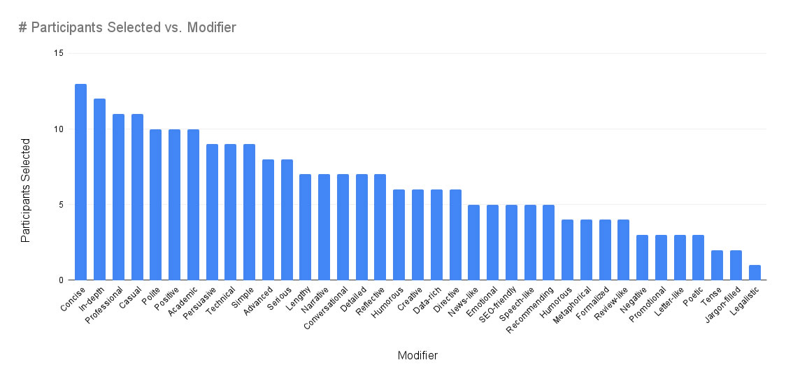
After validating the need, I conducted a mixed-mode survey to determine the ways that users would want their text to be modified. The results gave us a good starting point for further idea validation.
Wireframes
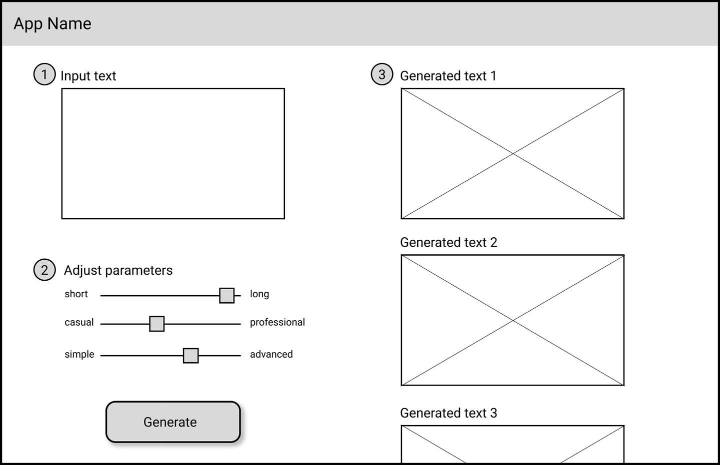
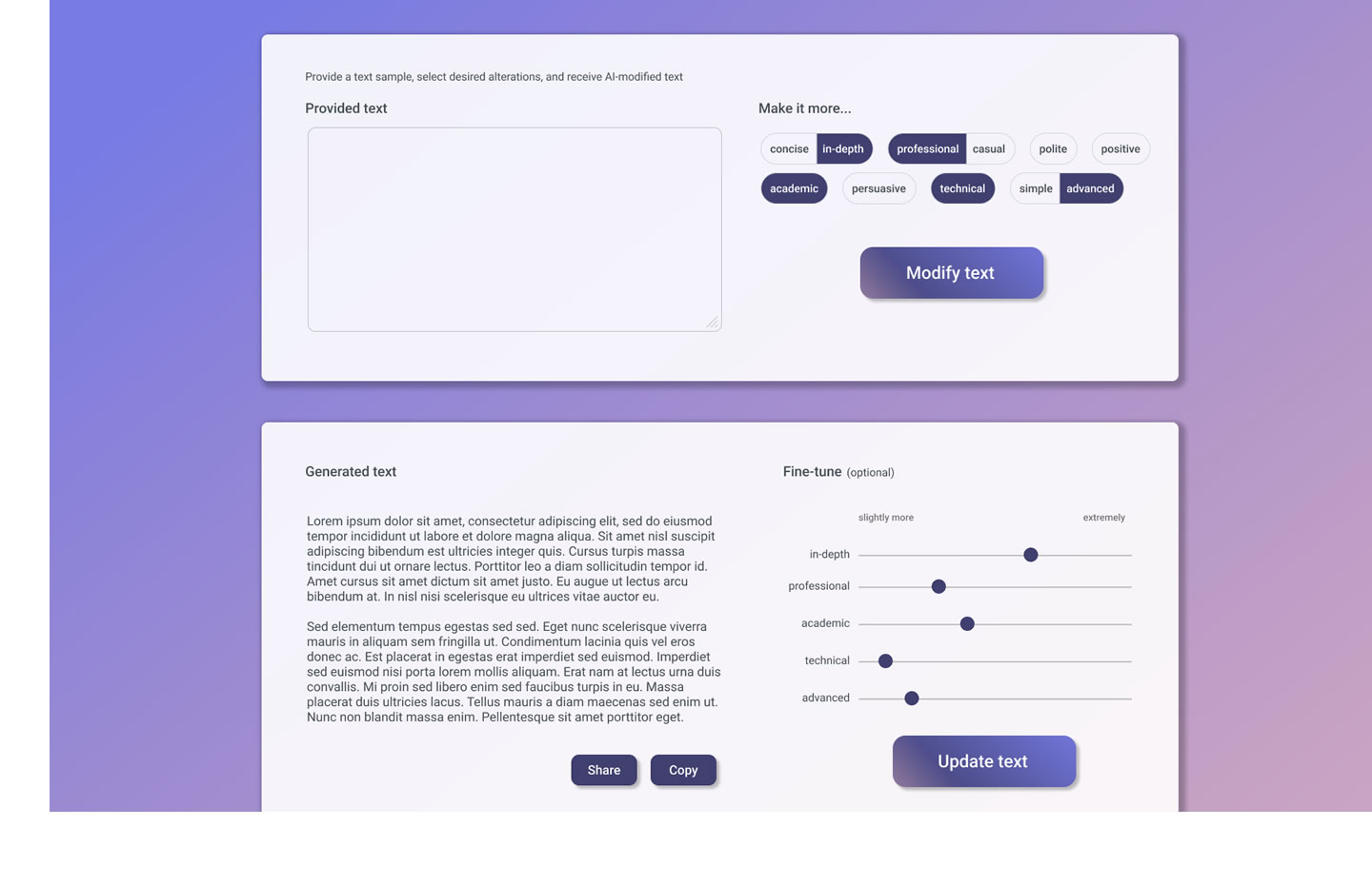
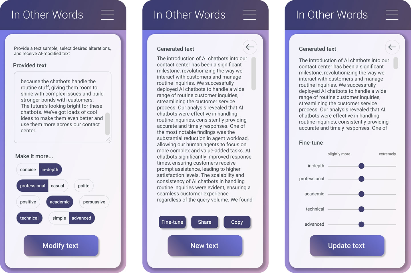
I built a simple wireframe. The primary features included an input box for entering text, a selection panel for the tone/style, and an output area for the final rephrased text. An iterative approach was used based on team reviews and user testing.
User Flows
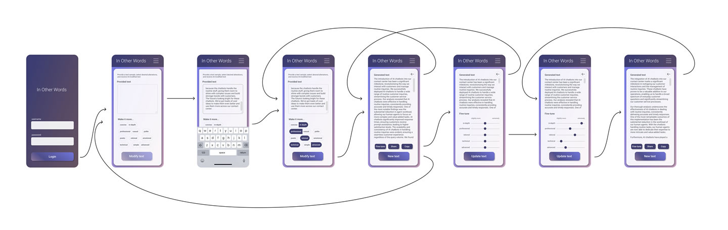
I created a user flow diagram to reflect how users would interact with the application, from text input to alteration selection, to refinement, and the final output. It was crucial to ensure an intuitive, efficient, and user-friendly design.
Mockups
Through iteration user testing, and design refinement, I crafted mockups for development to implement. We wanted something both simple and a little flashy to help convey the ease-of-use and the magic happening behind the scenes. Some exploration and testing was necessary to determine the best user flow and components for modifier selectors, and specifically mutually exclusive modifiers like professional/casual.
Results
“I wish I had this months ago!”
“Wow! This is a game-changer.”
“It is saving me so much time!”
In addition to a lot of positive feedback in follow-up interviews and surveys, we heard from users that they want more ways to modify text. So, we are planning to test and monitor designs with some additional modifiers to help increase value while keeping the interface easy to use.